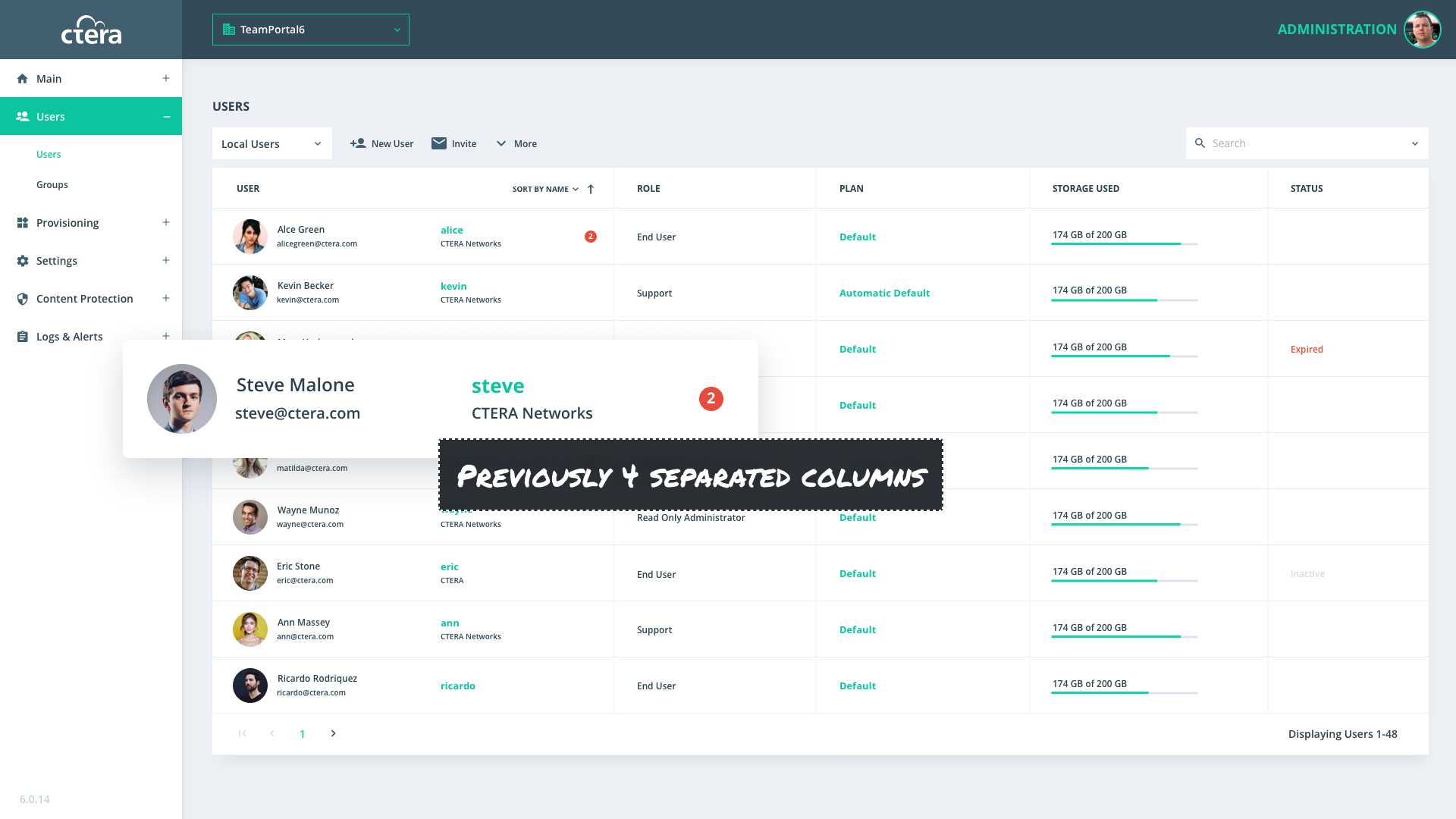
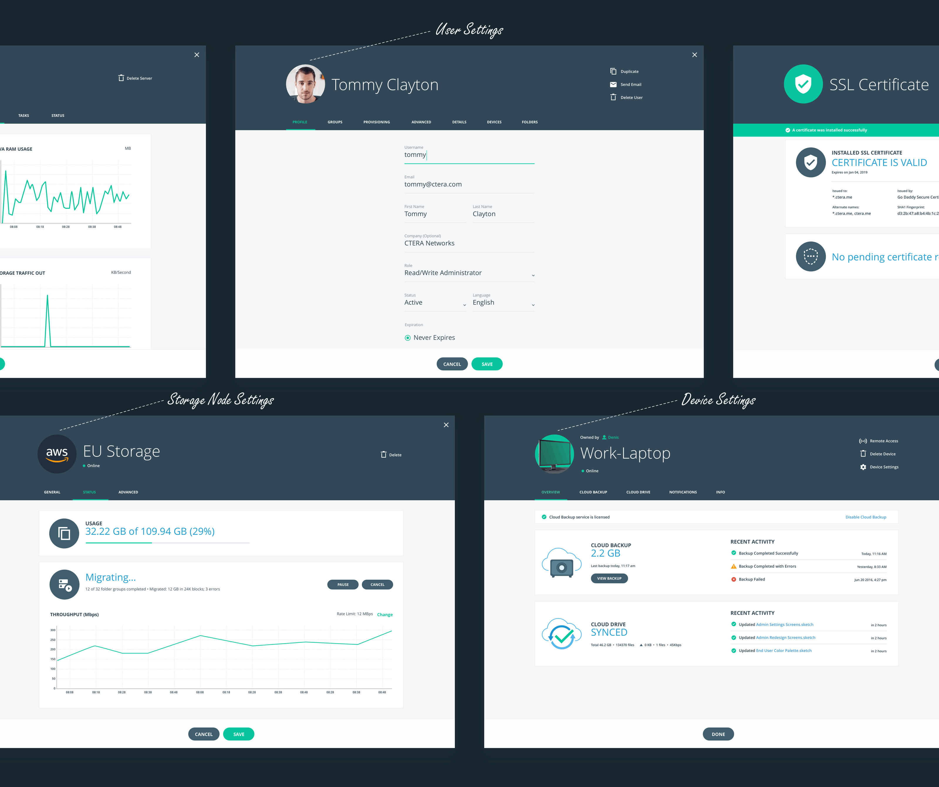
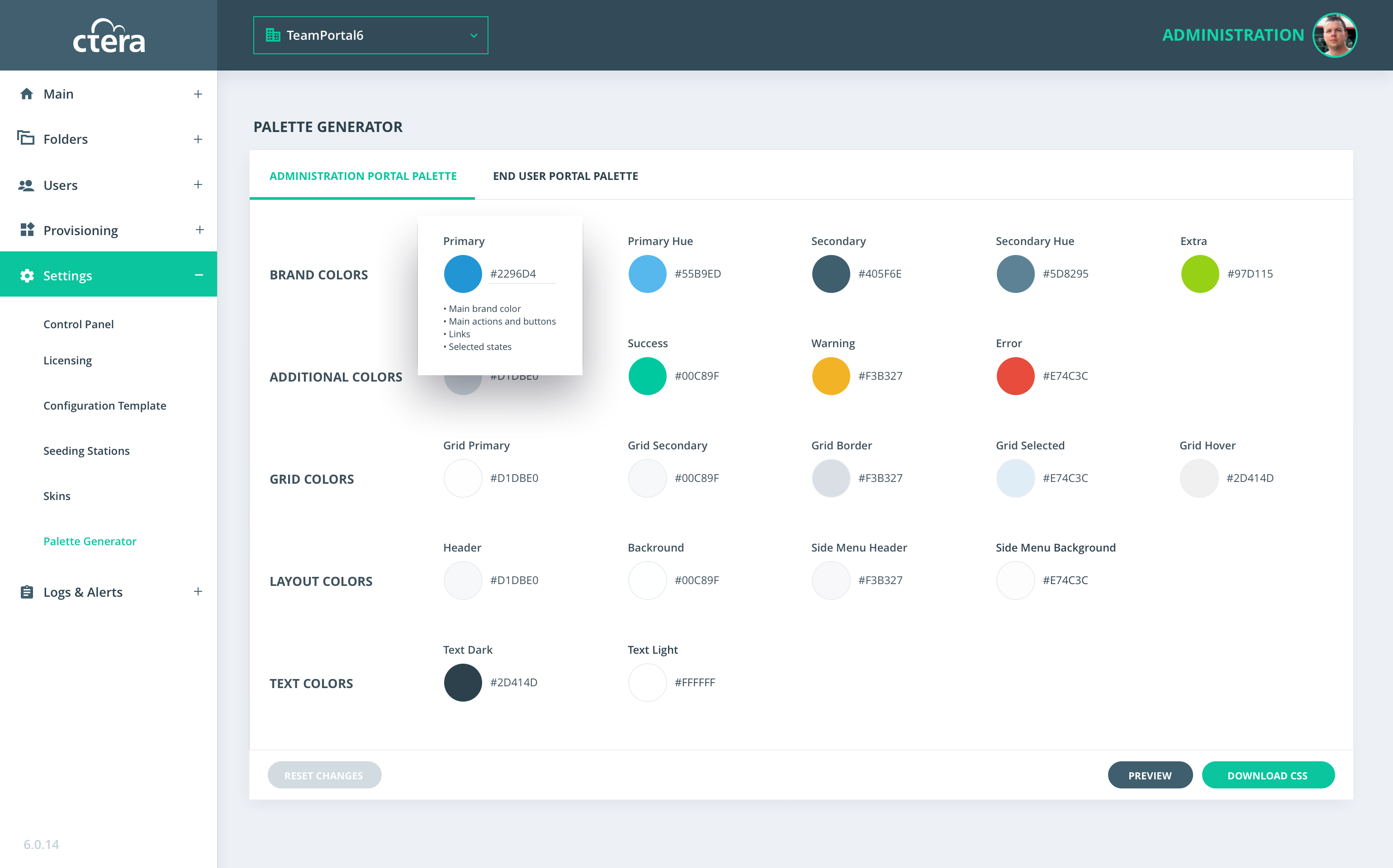
Administrator Portal

CTERA Networks
UX
UI
SaaS
B2B
Introduction
The Overview
CTERA provides cloud storage solutions that enable service providers and enterprises to launch managed storage, backup, file sharing and mobile collaboration services using a single platform and based on the cloud storage infrastructure of their choice.
Administrator Portal is very important because all CTERA clients are using it for defining policy, users, cloud folders, portals, devices, servers, storage node and many more.
The Goal
1
Fix usability based on clients' feedback
2
Switch from the old technology to Angular due to slow performance
My Role
1
Led the Design Part of the Project
As a Product Designer in CTERA, I worked closely with project stakeholders (CTO and Product Team) on analyzing clients feedback, usability issues and how to solve them
2
Collaboration with the Project Stakeholders
Collaborated with the GUI Team from the beginning by presenting mockups and verifying that new design solution meets developers schedule until final implementation
Design Process
Design Process
Normally, before “Design and Mockups” I do wireframes, but this step was skipped due to tight deadlines and not needing to start from scratch. As we had the old version and knew that we will use the Angular technology with its' library
Problems & Solutions
Navigation Issue
Unintuitive portal navigation located on the bottom of the screen
Solution
The solution was to follow the existing navigation design pattern and to place portal navigation on the top
Cognitive Overload
Data was not optimally organized. Result: too many columns causing a horizontal scroll
Too many empty cells that take up valuable screen real estate
Multiple icons that do not have any value and make layout visual clutter
Solution
Data reorganization and component creation displays data more cleanly. Result: the table is easy to read and is user friendly with real estate saved by removing many columns
Devices Screen
User Management Screen
Performance Issue
Slow performance due to old technology
Solution
I reviewed the Angular library and used existing elements in my designs to make the implementation progress faster. I collaborated with the GUI Team to create new components as needed
Settings Screens
Setting screens were unnecessarily small and crowded, not utilizing the available screen real estate. Users were forced to scroll and click more than needed
Categories were not intuitive to use, frustrating users who can't find the correct settings
Solution
Reorganization of content was built by my working closely with the CTO and the Product Development Team. settings open in the full screen with horizontal tabs navigation. Almost in all cases, users will see all tabs without any scroll
Settings Screens
Branding Issue
CTERA provides white-labeled product to the clients. Then clients have to replace CTERA assets with branded assets, also they should update CSS files manually. In addition, the fact that all assets were PNG/JPEG images made the process even more complicated. Many clients complained about this complex branding change process
Solution
In the redesign process, I used only vector assets, which allow color change by code, without replacing the asset itself. Also, I created a style guide with the color palette, icon sets, table elements, and typography and this allowed developers to link classes they use to the style guide. This is how we decided to develop Pallete Generator. This feature was not so complicated to implement and it brought additional value to CTERA clients. Now Admins can make fully branded skins for both Administrators and End User portals from one page
Palette Generator Screen
Palette Generator screen
Palette Preview Modal
Preview Dialog: live preview and download branded CSS files
Key Learnings
1
Collaboration is the Key to Success
This is not new for me, but worth mentioning. Working with other people directly, sharing the process, and getting feedback will help get better and much quicker results. I really believe that only with collaboration can we achieve a great product
2
Sketch is Awesome
Previously, I worked with Photoshop, but this project I decided to give Sketch a try. I was very impressed with this app, it was made exactly for what I needed: designing mockups, syncing screens to InVision for easy presentation and feedback collection, creating the style guide, and exporting assets to developers. This workflow was productive and worked perfectly for all teams
I am sure, that if I was doing the same project in Photoshop it could take a much longer time to get all these things done
3
SVG is a King
Using raster images in GUI can be frustrating. Monitors have become larger, some of them support retina, some of them don’t. This can be a reason that some JPEG or PNG images don’t look sharp, and this could drive a designer crazy. To verify this - ask your designer friend :)
In this project, I learned a lot about SVG files. During my work I came across new issues that have never troubled me before like: why are these vector icons looking pixaleted after implementation? Or, why are these icons not aligned? Now I got answers and know how to create a perfect icon set (even multi-colored)